Portion 85
Reimagining the Digital Presence of a Multi-Purpose Agricultural and Educational Hub. Designing a modern website that connects agriculture, education, tourism, and community development through a unified digital experience.
Year
2024
Service
UI/UX Prototype
Category
Agritourism
Tool
Figma

Project Overview
Portion 85 is a multi-purpose agricultural destination that combines farming, educational tourism, skills development, conferencing, and community empowerment. While its physical environment offers visitors a rich and immersive experience, its digital presence needed to better communicate the organization's diverse offerings and long-term vision.
This redesign focused on creating a modern, user-centred website that reflects Portion 85's mission while making information easier to discover and understand. The platform was designed to showcase educational programmes, agricultural facilities, guided tours, conferencing services, sustainable farming initiatives, and community development projects through a clear and engaging digital experience.
The goal was not only to improve the website's visual identity but also to create a platform that supports multiple audience groups—including tourists, students, educators, entrepreneurs, community stakeholders, and potential partners—each with unique goals and information needs.

The Challenge
Portion 85 offers a wide variety of services that extend far beyond traditional farming. However, presenting agriculture, tourism, education, conferencing, and community initiatives within a single website introduced a significant UX challenge.
The primary objective was to organise a large amount of information into a clear and intuitive structure without overwhelming users. Each audience needed to quickly find relevant information while maintaining a consistent experience that reflected the organisation's values of education, sustainability, and community development.
The Solution
The redesign focused on creating a clean, modern, and accessible interface that clearly communicates Portion 85's identity from the very first interaction.
The homepage immediately introduces visitors to the organisation through a bold value proposition, "We Are More Than Just A Farm," supported by immersive imagery that reflects the natural environment and authentic farming experience. Rather than focusing solely on agriculture, the messaging highlights the broader impact of the organisation across education, tourism, training, and economic development.
Navigation was intentionally simplified to provide quick access to the website's core sections, including Who We Are, Tours, Conferencing, Visitor Information, and Contact Us. A prominent Book Tour call-to-action encourages users to begin their journey immediately, while the inclusion of direct contact information improves accessibility for visitors who prefer immediate communication.
The visual design combines earthy imagery with a modern interface, balanced typography, and an orange accent colour that reinforces the brand identity while creating strong visual hierarchy. Large headings, generous spacing, and carefully structured content guide users naturally through the experience without feeling cluttered.
By simplifying navigation and organising information around user goals, the redesign creates an experience that is informative, engaging, and welcoming for every visitor.

Research & Inspiration
Before beginning the redesign, I explored websites across the agriculture, tourism, education, and non-profit sectors to understand how organisations communicate complex information to diverse audiences.
The research focused on:
Information Architecture
Multi-audience navigation
Tourism booking experiences
Educational websites
Community storytelling
Call-to-action placement
Responsive design
Accessibility
The findings informed a design that balances informative content with an engaging user experience while remaining true to Portion 85's mission.
Design Strategy
The design philosophy centred around "Connecting People Through Agriculture, Education, and Experience."
Every design decision was guided by the need to simplify complex information while creating an engaging platform that inspires visitors to explore, learn, and connect.
Key principles included:
Clear information hierarchy
User-centred navigation
Strong visual storytelling
Accessible layouts
Consistent branding
Responsive design
Action-oriented calls to action
Scalable content structure
Brand Identity
The visual identity reflects Portion 85's connection to agriculture, sustainability, and community development.
Colour Palette
Orange
White
Charcoal Grey
Natural Greens
The warm orange accent reinforces the brand while drawing attention to important actions such as booking tours and exploring key content.
Typography
A modern sans-serif typeface was selected to create a balance between professionalism and approachability. Large headings establish a clear visual hierarchy, while concise supporting text improves readability across all devices.
User Experience Design
The UX strategy focused on creating intuitive user journeys that would guide visitors through the website while encouraging exploration and engagement.
The experience was designed around four key questions:
What is Portion85?
What experiences and opportunities are available?
Why does its work matter?
How can visitors get involved?
User flows were developed to support these journeys while reducing friction throughout the browsing experience.
Key UX considerations included:
Simplified navigation
Clear content
Engaging storytelling
Mobile responsiveness
Accessible user interactions
Strategic conversion points
The goal was to create a seamless experience that allows users to move naturally from discovery to action.
User Interface Design
The visual design was inspired by the natural environment, agricultural landscape, and educational purpose that define the Portion85 experience.
The interface was designed to feel welcoming, authentic, and informative while maintaining a professional appearance.
Core design principles included:
Visual Storytelling
Large imagery and immersive content were used to showcase farming activities, educational experiences, facilities, and community initiatives.
Strong Visual Hierarchy
Typography, spacing, and layout systems were carefully structured to guide user attention and improve readability.
Consistency
A cohesive design system ensured consistency across pages, creating a unified experience that reinforces the brand identity.
Accessibility
Accessibility best practices were incorporated to improve usability across devices and user groups through clear typography, responsive layouts, and intuitive navigation patterns.
Facility and Experience Showcase
A dedicated section was developed to highlight the farm's unique facilities and experiential learning environments. This allows visitors to explore the variety of activities and opportunities available on-site.
Conference and Functions Hub
A dedicated section was designed to showcase Portion85's conferencing and event facilities, providing potential clients with clear information about available spaces, venue capabilities, and event opportunities.
The experience was structured to support a variety of use cases, including:
Main Conference Hall
Executive Boardroom
Workshop Spaces
Outdoor Event Area
Community and Economic Impact
The website highlights Portion85's contributions to skills development, entrepreneurship, job creation, and community empowerment, reinforcing its role as more than just a tourism destination.
Primary User Flow
Home
Learn About Portion 85
Explore Tours & Programmes
View Visitor Information
Book a Tour or Make an Enquiry
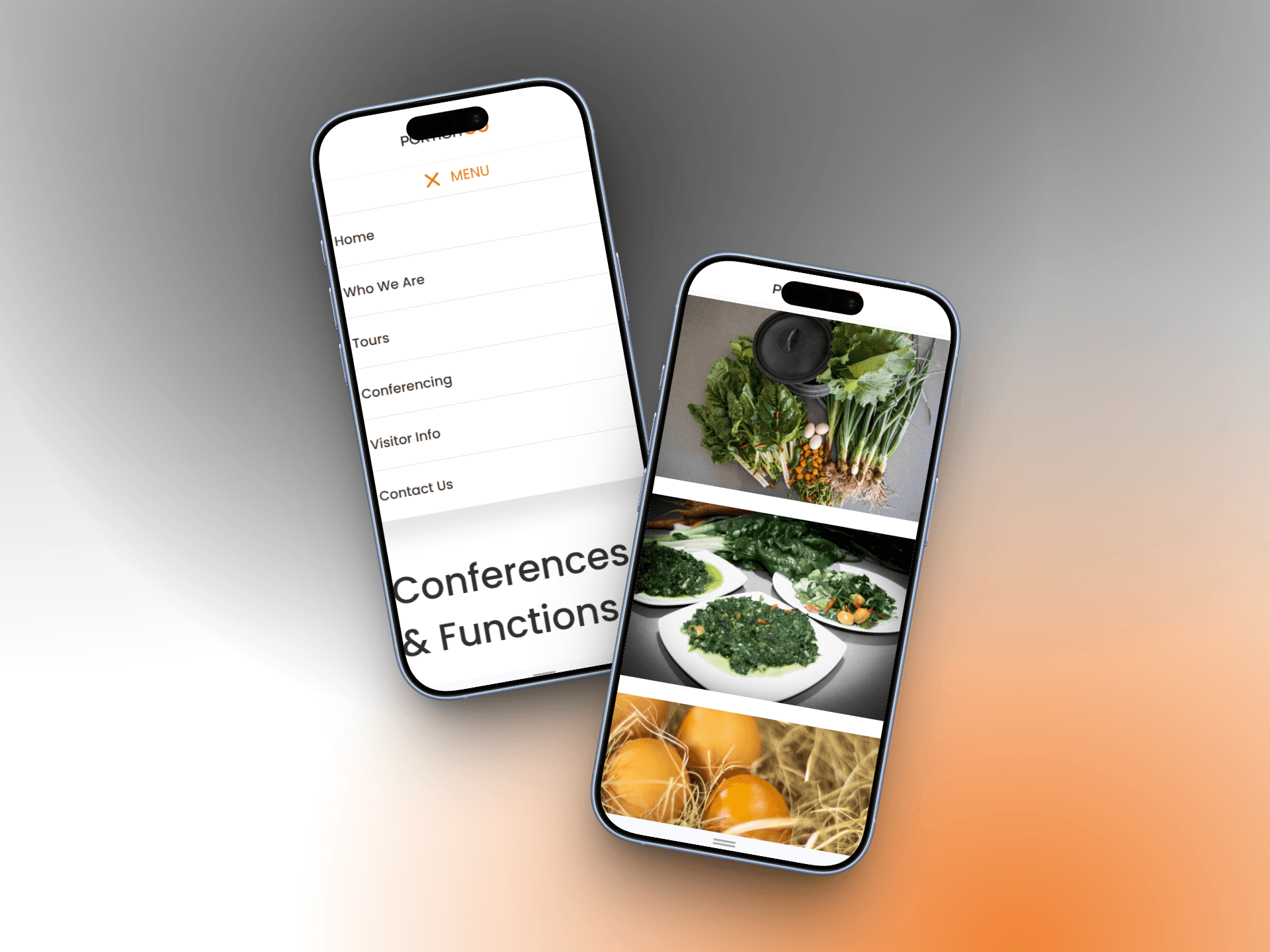
Responsive Design
The website was optimized across desktop, tablet, and mobile devices to ensure a consistent and accessible experience regardless of screen size.
Results
The redesigned website successfully transformed Portion85's digital presence into a platform that reflects the scale and impact of its mission.
Outcome
The redesign transforms Portion 85's online presence into a platform that better reflects the organisation's purpose and impact. Through improved navigation, stronger visual storytelling, and a more structured information architecture, the website creates a seamless experience for a diverse audience while showcasing the organisation's work across agriculture, education, tourism, and community development.
The final prototype demonstrates how thoughtful UX design can simplify complex information and create meaningful digital experiences that support both organisational goals and user needs.
Reflection
This project strengthened my ability to design for organisations with multiple audiences and diverse content requirements. It reinforced the importance of information architecture, user-centred navigation, and visual storytelling when designing platforms that need to communicate complex services in a simple and engaging way.
Rather than focusing solely on aesthetics, the redesign emphasised clarity, accessibility, and purposeful user journeys, ensuring visitors could easily discover the information most relevant to them while gaining a deeper understanding of Portion 85's mission and impact.


